While working on a new web app at work, I've been flip flopping between two designs for forms: using top-aligned or left-aligned labels. While this was on my mind, a Hacker News entry appeared for an article claiming top-aligned labels are easier for users to scan and require less eye movement.
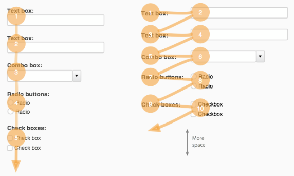
The article cautions that designs with top-aligned labels take up more vertical space. Users are fairly comfortable with scrolling vertically in web pages, though, and forms can be split up into separate pages if they become too unruly.
This makes sense anecdotally, but it would be nice if the article gave citations for studies backing the claim up.
UX Movement - Why Users Fill Out Forms Faster With Top Aligned Labels